
At Home
Teresa’s home brings together polished furnishings, thrifted finds, meaningful objects and pieces she has transformed herself. Traditional and modern sit comfortably together, without everything needing to match or belong to one style.
Some choices are bold and others are quiet. Many hold a memory, tell a story or remind her of a person or place. Those details come together in the unexpected combinations that have always been part of Teresa’s creative life.


First Impressions
Bright, restrained and grounded in contrast.
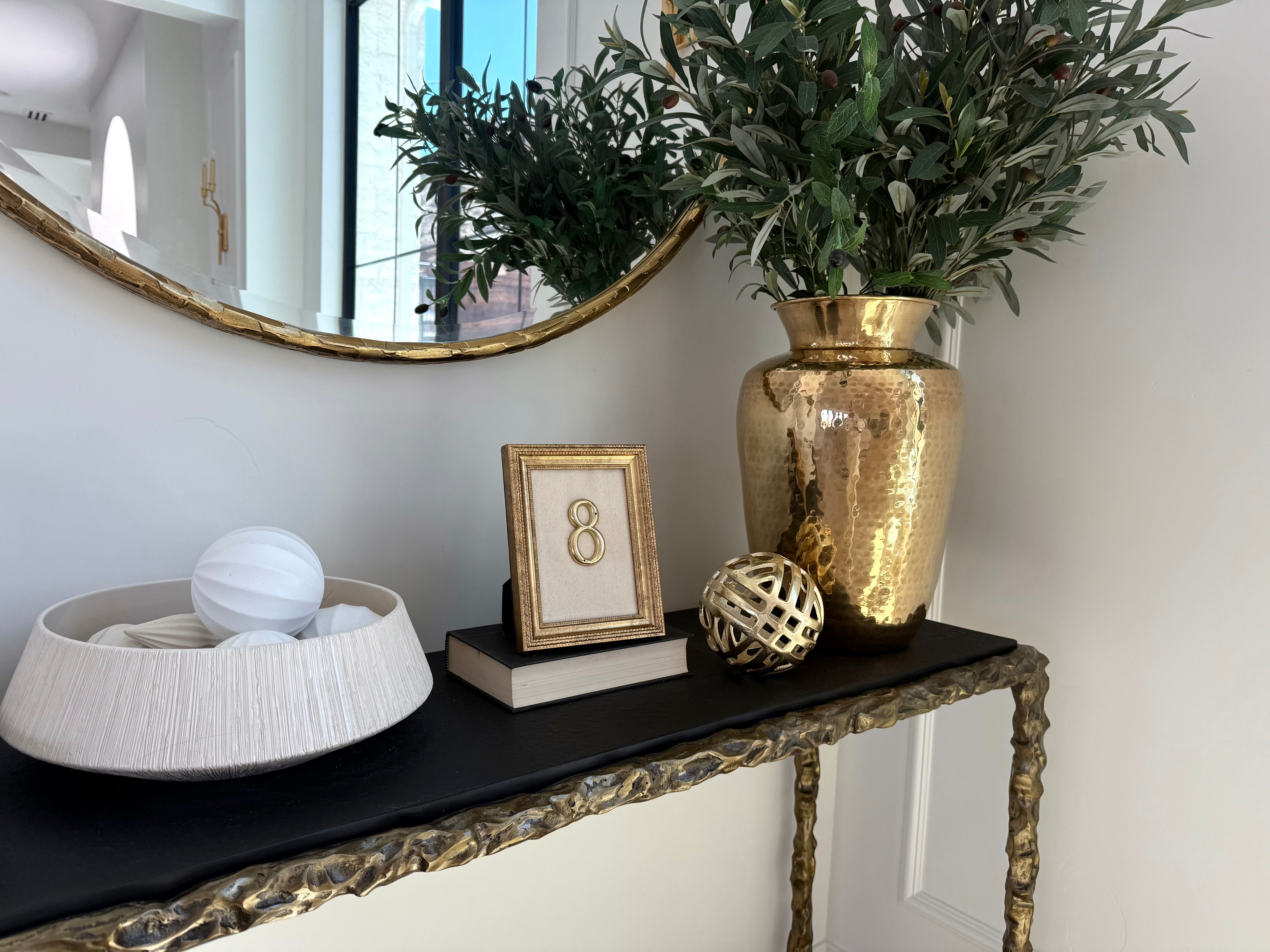
The foyer is bright and restrained, allowing the architecture to take the lead. Light walls create an open backdrop, while the black door and staircase give the room definition.
Black architectural elements frame the softer finishes and create contrast without making the space feel heavy. Small metallic details add warmth throughout.


“A bright room still needs something strong enough to hold it together.”
Living Room
Light, relaxed and grounded by strong black details.
The light palette keeps the room calm without making it feel formal. Soft furnishings, warm finishes and generous spacing give each piece room to be noticed while the overall space remains comfortable and approachable.
The fireplace creates a natural center, while black and gold accents bring definition to the lighter surroundings. The contrast gives the room structure without taking away from its softness.


“A room can feel luxurious without feeling untouchable.”
Office
The deeper palette gives this room a quieter, more private feel.
The office feels distinctly different from the lighter rooms around it. Dark walls create a more enclosed setting, while pale upholstery, reflective finishes and warm metallic details keep the space from feeling heavy.
Books, artwork and personal objects add another layer, making the room feel used and individual rather than overly styled.


“The room feels most personal when it is allowed to be different from everything around it.”
Dining Room
A long table, repeated forms and strong contrast give the room its structure.
Its length gives the space a sense of occasion, while repeated chairs and wall panels create a steady rhythm around it.
Against the lighter palette, the black arched doorway becomes part of the composition, giving the room definition and a strong visual pause.


“The best dining rooms are remembered long after dinner is over.”
Family Room
Open to the kitchen and filled with natural light, the family room balances comfort with strong architectural contrast.
The height of the room and the natural light give the space scale, while the fireplace and layered furnishings keep it grounded and comfortable.
Black railings, doors and window frames give definition to the lighter palette. Small touches of gold soften the contrast and connect to details seen throughout the rest of the home.


“The most inviting rooms are the ones that make you want to stay.”
Kitchen
Light wood, pale stone and warm metals give the kitchen a softer take on a clean, modern space.
Light wood cabinetry softens the scale of the room, while pale stone surfaces keep it bright and open.
Brass hardware, sculptural lighting and woven seating add warmth and texture to the quieter finishes.


“My goal is to create meaningful space for living.”
Pantry
A fully equipped space for storage, prep and entertaining.
From the kitchen, the entrance reads as part of the surrounding cabinetry. Once opened, it leads into a long pantry with storage, refrigeration, a sink and additional preparation space.
Dark tile, warm metallic details and patterned flooring give the room its own character, while cabinetry and open shelving provide plenty of practical storage.


“A working space can be practical and still feel intentional.”